Here’s three quick methods I use to add more personality to coding Agent UI – when it turns out fine … but your edgy ideas are thirsting for a cooler showcase …
1. UI Samples
A Google Images search for ‘creative (fill in the blank for app type) UI’ will often return a decent variety of layouts and color combinations, that you can then ask Cursor Agent to copy.
Sometimes it will even find articles that show all the features my app doesn’t yet have, lol – so it can be great for getting ideas too.
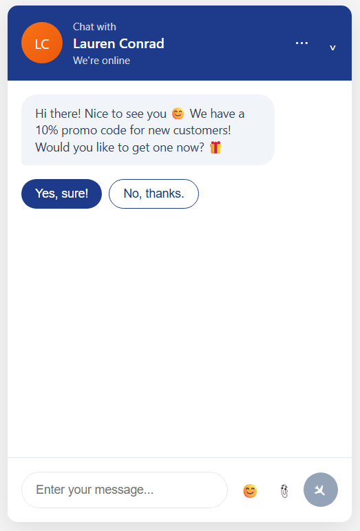
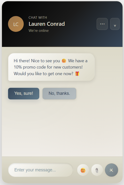
Gave the pic on the left to Cursor Agent, and the UI on the right was their version.

2. Color Palettes
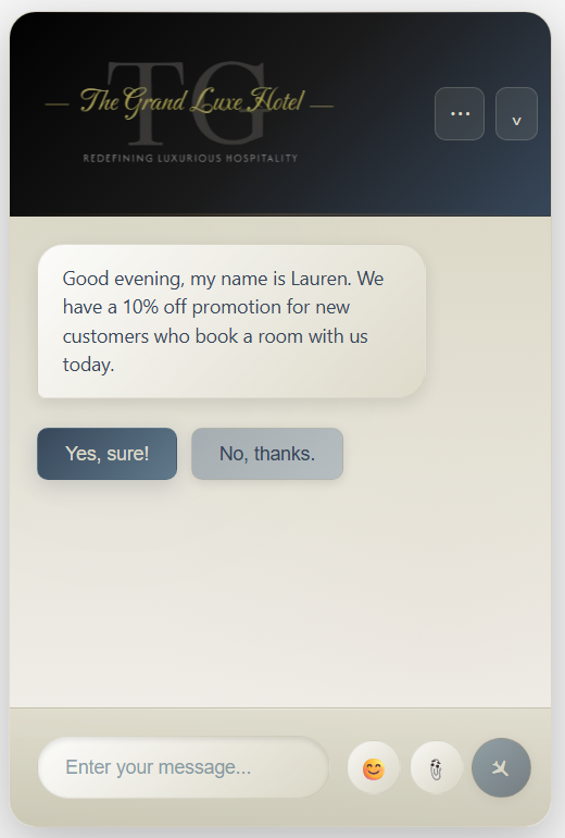
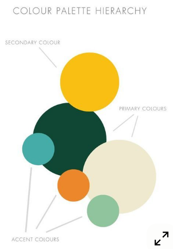
If it’s still looking mid, will next search Google Images for ‘ui color palettes hex codes for a (fill in the blank type site)’. Here I asked for a color palette for a luxury hotel.
Gave the pic on the left to Cursor Agent, and they transformed the version above to the one below.
The only change I made myself was to increase the height of the header (Edit: oh, and made the buttons a bit more square)

3. Logo.com
A final touch will sometimes add is a custom logo picked from one of the AI creations at Logo.com
Will just do a screen cap (photoscape.org) of the one I choose, and remove the background (remove.bg) before adding it to the header.
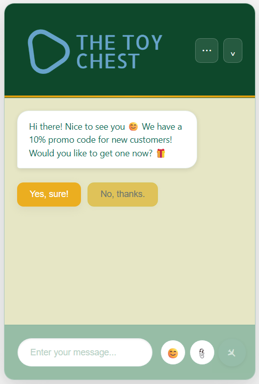
Here’s a second example for a Children’s Toy Store
Had to define ‘aesthetically pleasing’ for Cursor Agent, when it came to adding bright colors to the mix, by giving the following rules:
- Contrast is important for readability, but please limit the amount of white to what’s necessary and use the palette colors instead
- Brights are best for accenting action you would like to draw the user’s attention to
- Please try to use all the colors
(and still needed to do a bit of cleanup – but not much)
If anybody has any other tips & tricks for how to get something other than the usual from Agents/Assistants, would love to hear them!!
Thanks for reading ✨